#pol viladoms
Explore tagged Tumblr posts
Text
0 notes
Photo


REFURBISHMENT IN ST. JULIÀ DE LÒRIA
Client: Privat Year: 2021 Location: Sant Julià de Lòria, Andorra Area: 570m2 Project: Llamazares Pomés Arquitectura with Altura Arquitectes Collaborators: Roser Estelrich Constructor: Purroy Photographies: Pol Viladoms
2 notes
·
View notes
Photo

House Renovation Montcada (2019) Architects: Hiha Studio Location: Montcada i Reixac, Catalonia, Spain Photo: Pol Viladoms
#Hiha Studio#Montcada i Reixac#Montcada#Catalonia#Spain#2010s#architecture#exterior#street#Pol Viladoms
4 notes
·
View notes
Photo


SEU CENTRAL DE VALLBANC REFORMA INTEGRAL
Client: Vall Banc Any: 2017- En curs Lloc: Av.Carlemany, C/Unió i C/Sant Antoni, Andorra Superfície: 3700m² Projecte: Llamazares Pomés Arquitectura amb Ginjaume Arquitectura i Paisatge Col.laboradors: Alba Julià, Noelia Faílde, Roser Estelrich i Marta Silva Constructor: Cevalls Fotografies: Pol Viladoms
Renovació de la seu central de Vall Banc com a banc d’última generació. La reforma es durà a terme en diverses fases. La primera fase es centra en l’embolcall donant visibilitat a través de la façana. La resta de fases encara en procés, consisteix en la remodelació integral de diverses plantes ambun predomini de tons clars, llum càlida i detalls en fusta.
#Llamazares Pomés#Ginjaume#oficines#andorra#vallbanc#Noelia Faílde#alba julià#Roser Estelrich#marta silva#pol viladoms
2 notes
·
View notes
Photo


SEDE CENTRAL DE VALLBANC REFORMA INTEGRAL
Cliente: Vall Banc Año: 2017- En curso Lugar: Av.Carlemany, C/Unió y C/Sant Antoni, Andorra Superficie: 3700m² Proyecto: Llamazares Pomés Arquitectura con Ginjaume Arquitectura i Paisatge Colaboradores: Alba Julià, Noelia Faílde, Roser Estelrich y Marta Silva Constructor: Cevalls Fotografias: Pol Viladoms
Renovación de la sede central de Vall Banc como banco de última generación. La reforma se realizará en varias fases.
La primera fase se centra en el la envolvente dando visibilidad a través de la fachada. El resto de fases aún en proceso, consiste en la reforma integral de varias plantas con un predominio de los tonos claros, luz cálida y detalles de madera.
#oficinas#Llamazares Pomés#Ginjaume#andorra#vallbanc#arquitectura#Noelia Faile#Marta silva#Roser Estelrich#alba julià#workinprogress#pol viladoms
0 notes
Photo
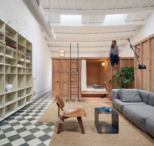
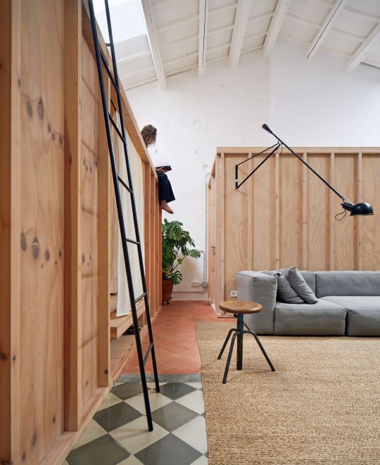

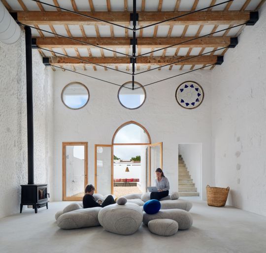
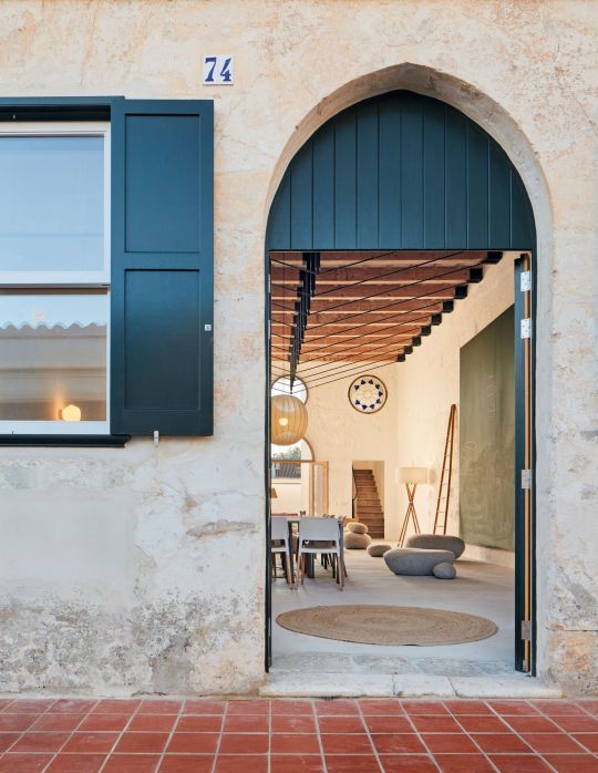
Artchimboldi Menorca / Anna Truyoli, Emma Martí Photos © Pol Viladoms
674 notes
·
View notes
Photo

Can Jordi & Anna by Hiha Studio @hihastudio _____________________ Location: Lleida, Spain (2018) . Photography by Pol Viladoms @polviladoms . . . @mukadesignsociety #mukaCASEstudy #DiAcaseSTUDY @designstudio_mag . #designstudiomag #architecture #building #stairs #housing #buildings #architecture_hunter #architektur #design #minimal #concrete #barngrass #concretearchitecture #minimalistic #architecturelovers #modernhomes #architecture_minimal #housedecor #archilovers #architectureporn #arquitecturaydiseño #architecturestudent #architecturedesign #architecture_best #architecturephotography (presso Spain) https://www.instagram.com/p/Ch6h6EFtjw2/?igshid=NGJjMDIxMWI=
#mukacasestudy#diacasestudy#designstudiomag#architecture#building#stairs#housing#buildings#architecture_hunter#architektur#design#minimal#concrete#barngrass#concretearchitecture#minimalistic#architecturelovers#modernhomes#architecture_minimal#housedecor#archilovers#architectureporn#arquitecturaydiseño#architecturestudent#architecturedesign#architecture_best#architecturephotography
7 notes
·
View notes
Text
https://divisare-res.cloudinary.com/images/c_limit,f_auto,h_2000,q_auto,w_3000/v1648467383/f654psijgwujirlpqdkw/anna-truyol-artchimboldi-emmamarti-arquitectura-pol-viladoms-artchimboldi-menorca.jpg

17 notes
·
View notes
Text
Structure - Research

Hélène Binet,Daniel Libeskind/Studio Libeskind, Jewish Museum, Berlin, Germany, 1996.
Binet knows how to utilise light to really project the atmosphere of a space through her images. Here we can see some natural light spilling through into the darkness from what to us appears be a smaller triangular shaped gap, this small gap (small in conjunction with the framing, rather, since upon closer inspection, this is actually just a wide gap) creates a large highlight on the ground. This creates a rather emotive image and emphasizes the skill of the photographer's eye for detail when it comes to framing and creating a particular mood. This space is very liminal with mainly flat concrete surfaces with the occasional deflection with sharper edges or protrusions from the wall. Binet's positioning of the camera like aforementioned only emphasizes the details of the architects vision, showcasing them from a slightly different perspective. The photographer's contemplation of light along with the architect's creation makes for some contrasting highlights and shadows which only enhance the shapes, and details of the structure. It is important to note that the building photographed is a Jewish Museum, for me, this only heightens the importance of the architects formation of space, and Binet's capturing of this space. There is a real feeling of isolation from this structure, this is only emphasized by the light, the shadows being cast, the opening to another space being in total darkness. You can truly feel the consideration that the photographer has put into the framing of this image and is breathtaking.


Pol Viladoms, Walden 7, Ricardo Bofill
The first image gives insight to the sheer size of this building. It's cluster like, irregular shape is the most distinctive feature, along with the signature Bofill vibrant colour. The image being captured slightly more towards the left hand side gives easier distinction of the segmentation of the building, that being the 18 adjoining towers, which can be difficult to tell at first. This viewpoint also allows us to see the lack of symmetry in each tower as the side of one tower looks different from the other.
In the second image, we really can grasp the scale of the building more as the individual walking into the exaggeratedly large opening looks miniature. This detail shot shows of the inconsistent placement of windows,uniformly disorganised. We can also see in this image due to the closer proximity, that both the frame of the entrance and the curves of the windows are actually tiled. The more side on framing allows more contrast on the urban windows which looks flattering on the tile. This angle also allows us to see that the building protrudes out more around the corner due to the zigzag like lines of the side of said section.

Naquib Hossain, National Assembly, Bangladesh, Louis Kahn
The photographers choice of a viewpoint and framing is important in this image. In terms of the path leading to the actual building the photographer is at a higher viewpoint. This puts into perspective the sheer scale of the building as the person visible looks tiny in comparison, similar to the lampposts lining the path. The path coming from the left hand side with the person walking in the centre of this path leads your eyes to the colossal structure. The visibility of the water sets up the location of the building and provokes awe as it is an unorthodox placement for a building.
The gaping geometric shapes in the concrete captures your attention the most as it is a break in the horizontal lines, as well as being a unique feature, you can't help but gaze at it. The photographers placement more toward the side of this part of the building obviously emphasizes the three -dimensionality of the building but also allows you to catch a glimpse of what is inside which turns out aligns nicely with the exterior as there are horizontal lines visible, this could be from that of a walkway or balconies.

Salva Lopez, La Muralla Roja, Ricardo Bofill
The photographer has taken the image at a high viewpoint, looking down on the stairs, facing slightly towards the right. This shift to the right makes for a more chaotic subject as some of the lines are distorted, appearing to be not straight. The cropped in framing means that where the stairs lead to, is not visible. This gives the stairs a labyrinthine look with the decline in level of the rectangular shapes almost mimicking the stairs. This image is reminiscent of Relativity (M. C. Escher) due to the way that the stairs seemingly overlap, as well as the symmetry of the stair at the top of the image which looks as though there is a reverse stair set underneath.

David Biggins, Shakespeare Tower, Barbican Estate, Chamberlain, Powell and Pon
Standing tall at 404ft, the low viewpoint makes the building seem like it is touching the sky. Every floor of this building is stacked in perfect symmetry, totally in line. The framing, from the corner of the building makes the building seem like it is other than rectangular.

Arnaud Poterie, The Cathedral of Saint Mary of Assumption,
The photographers inclusion of the altar area and pews, conveys the architectural symmetry as well as decorative. The angular lines of the low ceiling helps to real that this opening in the ceiling is paraboloid in nature. The juxtapose between the warm glow of the actual church area and the industrial materials and greys of the ceiling is rather striking, as this is not the sort of architecture that you tend to associate with churches. The central framing, with the slight tilt allows for the paraboloid to take up most of the frame and allows the beams on the left and right hand size to be more visible which again emphasizes the shape of the opening, revealing the gentle curves in the upper area . The sunlight flowing in through the stained glass windows, reflecting on to the triangular carcass holding the concrete surface has a very spiritual feel to it.
The light shining through was definitely visible whilst shooting, however I think the photographer made some global adjustments during post production to deepen the more vibrant glow.
Adrian Deweerdt, Luma Tower, Frank Gehry
1 note
·
View note
Photo
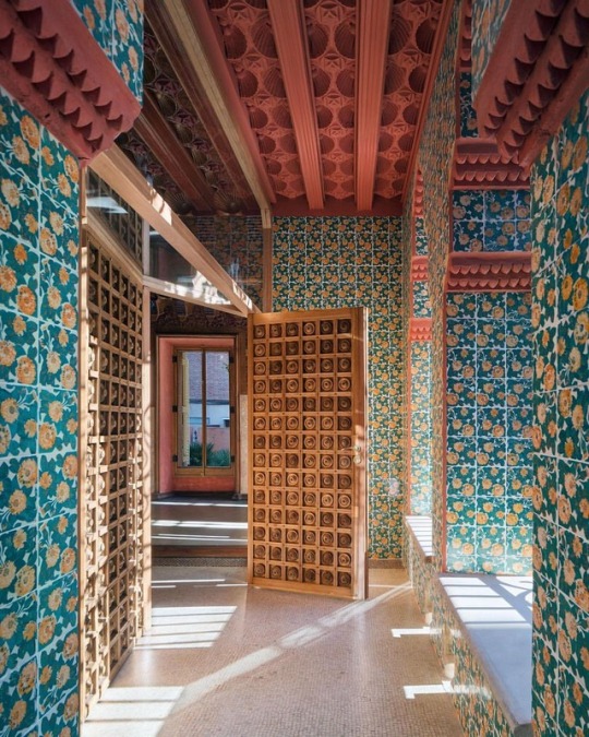
Antoni Gaudí's @CasaVicens Vicens Opens its Flamboyant Doors to the Public After 130 Years / https://www.yatzer.com/casa-vicens-gaudi #yatzerized #casavicens #BARCELONA #antonigaudi #architecture #interiordesign Photo by Pol Viladoms. (at Barcelona, Spain)
307 notes
·
View notes
Photo


VALLBANC HEADQUARTERS RENOVATION
Client: Vall Banc Year: 2017- Actually Location: Av.Carlemany, C/Unió & C/Sant Antoni, Andorra Area: 3700m² Project: Llamazares Pomés Arquitectura with Ginjaume Arquitectura i Paisatge Collaborators: Alba Julià, Noelia Faílde, Roser Estelrich & Marta Silva Constructor: Cevalls Photographies: Pol Viladoms
#vallbanc#Llamazares Pomés#Ginjaume#andorra#interiorarchitecture#Noelia Faílde#roser estelrich#marta silva#alba julià#offices#pol viladoms
2 notes
·
View notes
Link

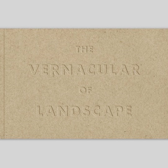
The Vernacular of Landscape
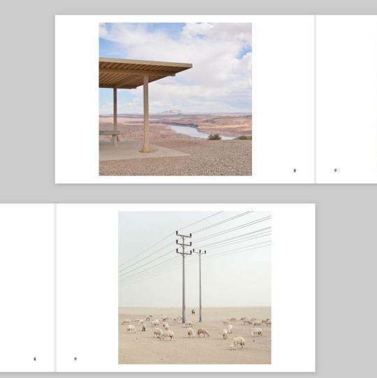
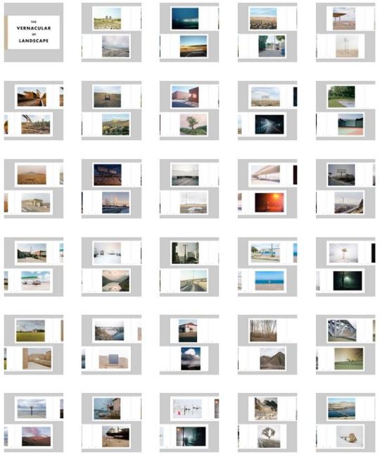
The Vernacular of Landscape is a survey of contemporary landscape photography curated by Noah Waldeck and co-edited by Float Photo Magazine. Showcasing images from 58 artists from around the world, this 60 page perfect bound books measures 8.5×5.5″ and features a debossed recycled paper cover. With work from:
Rob Stephenson, Diana Nygren, Patrick Warner, Tim Dechent, Lewis Ableidinger, Nathanial Schmidt, Emmanuel Monzon, Roger Grasas, Michael Wriston, Nick Zukauskas, Daniel George, Adrien Blondel, Ivan Echevarria, John Sanderson, Paul Sisson, Sandro Katalina, Brooks Geenen, James Doyle, Christiaan Kritzinger, Raul Guillermo, Tod Kapke, Cody Schlabaugh, Cristian Ordonez, Balint Alovits, Pratya Jankong, Danny Rowton, FeiFan Zhang, Reid Elem, Anthony Onesta, Joshua Oldfield, Ryan Parker, Maxime Taillez, Balazs Fromm, Julian Reid, Franck Doussot, Dineke Versluis, Irene Tondelli, Cody Bratt, Matthew Portch, Leonardo Magrelli, Christian Kondic, Solange Adumabdala, Kyle Everett Smith, Berber Theunissen, Dan Mariner, Michael Garbutt, Fred Guillaud, Mattia Paladini, Yorgos Efthymiadis, Stephen Berry, Lawrence Braun, Will Cox, Morgane Erpicum, Liam McMillan, Pol Viladoms, Jeff Phillips, Chris Bennett & Chris Round
Subjectively Objective is a contemporary photography gallery and publisher founded and curated by Noah Waldeck. The type of phrase you could picture as the subject of an Ed Ruscha painting, the name Subjectively Objective sums up our ideas about the nature of photographs. Our main focus is on contemporary landscape and conceptual work that embraces that inherent subjectivity in the photographic medium, depicting the world from the artist’s unique perspective.
3 notes
·
View notes
Photo
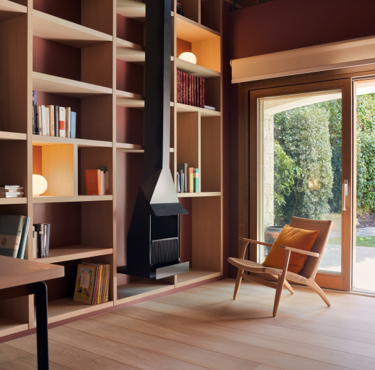
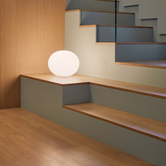
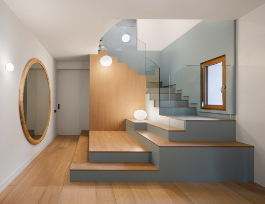
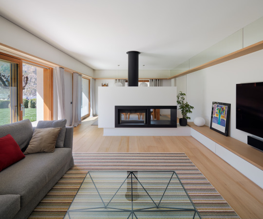
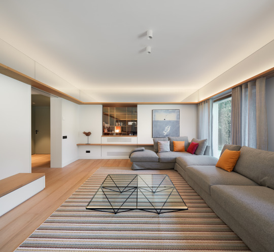
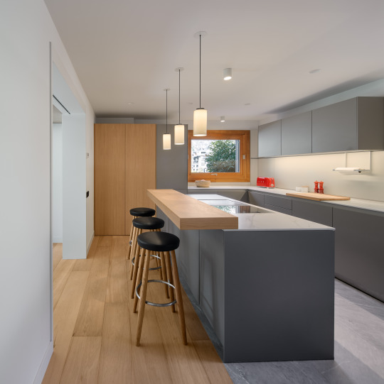
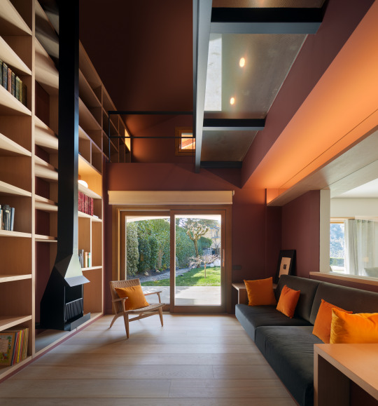
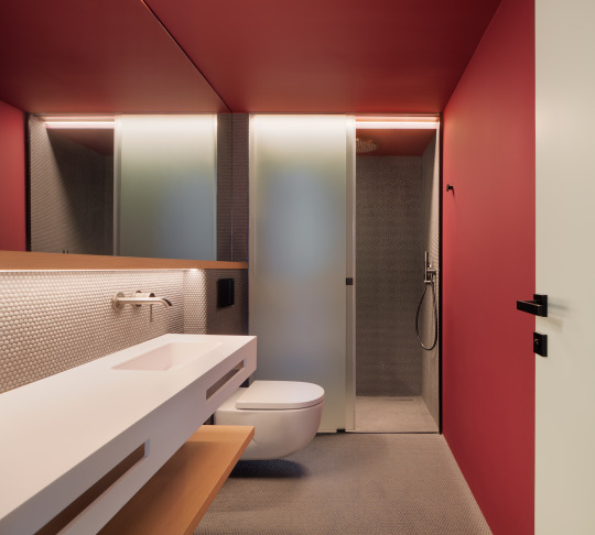
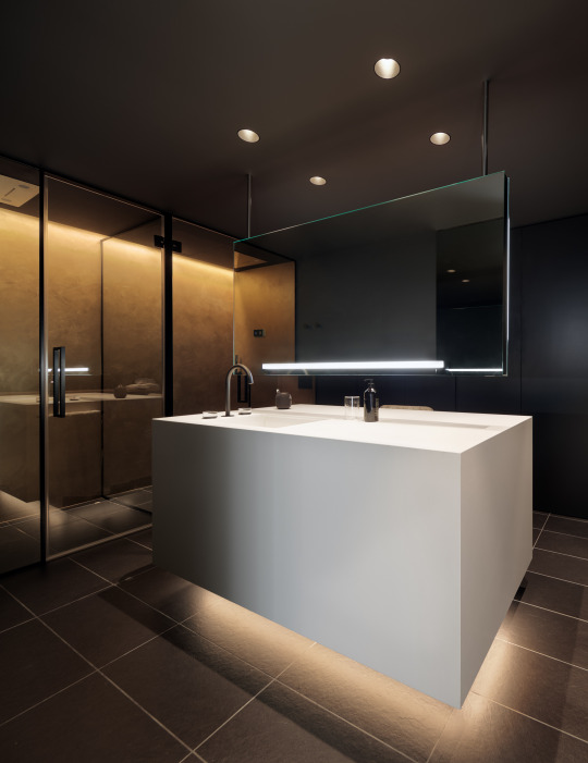
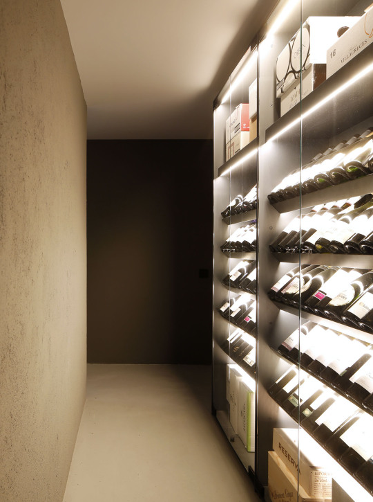
CASA A ST. JULIÀ DE LÒRIA REFORMA INTEGRAL
Client: Particular Any: 2021 Lloc: Sant Julià de Lòria, Andorra Superfície: 570m² Projecte: Llamazares Pomés Arquitectura amb Altura Arquitectes Col.laboradors: Roser Estelrich Constructor: Purroy Fotografies: Pol Viladoms
#arquitectura#interiorisme#residencial#habitatge#reforma#andorra#altuzarra#llamazarespomes#polviladoms#roserestelrich#santjuliadeloria
2 notes
·
View notes
Text
ArchDaily - A&A Apartment / LoCa Studio

© Pol Viladoms
architects: LoCa Studio
Location: Carrer de Vilardell, 20, 08014 Barcelona, Spain
Project Year: 2020
Photographs: Pol Viladoms
Area: 93.0 m2
Read more »
from ArchDaily https://www.archdaily.com/950483/a-and-a-apartment-loca-studio Originally published on ARCHDAILY RSS Feed: https://www.archdaily.com/
#ArchDaily#architect#architecture#architects#architectural#design#designer#designers#building#buildin
0 notes
Photo


CASA EN ST. JULIÀ DE LÒRIA REFORMA INTEGRAL
Cliente: Particular Año: 2021 Lugar: Sant Julià de Lòria, Andorra Superficie: 570m² Proyecto: Llamazares Pomés Arquitectura with Altura Colaboradores: Roser Estelrich Constructor: Purroy Fotografías: Pol Viladoms
5 notes
·
View notes
Photo


Cal Jordi&Anna / Hiha Studio
Photos © Pol Viladoms
391 notes
·
View notes